It’s 2015 and if you aren’t using your fitness website to build your business and make money you need to get to work! I am presuming since you are either using Trainerize to train clients, or are interested in purchasing Trainerize, you are already aware of the money to be made online and how to use fitness marketing to do that. Before you can promote your business and make more money online it’s important to focus on creating a strategic and appealing website to keep readers coming back and sharing with others.
There are many aspects to building an epic fitness website, but here are the top 5 things every business website should contain to even have a hope of converting regular visitors into paying customers.
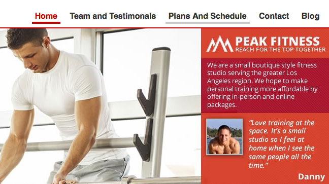
Overall Look is Clean and Easy to Navigate
We are fitness professionals, not website designers, so don’t be afraid to hire someone or get advice to make sure your website looks clean and is user friendly. An option is to try and work out a deal with a website designer to offer free training or fitness advice to website services (at least it’s always worth a try!) The initial design of a website can be complicated and time consuming, you should be spending that time working on your business. Leave the computer stuff to the experts to save yourself the time and stress! The initial investment will be worth it in the long run!
Email Opt-in
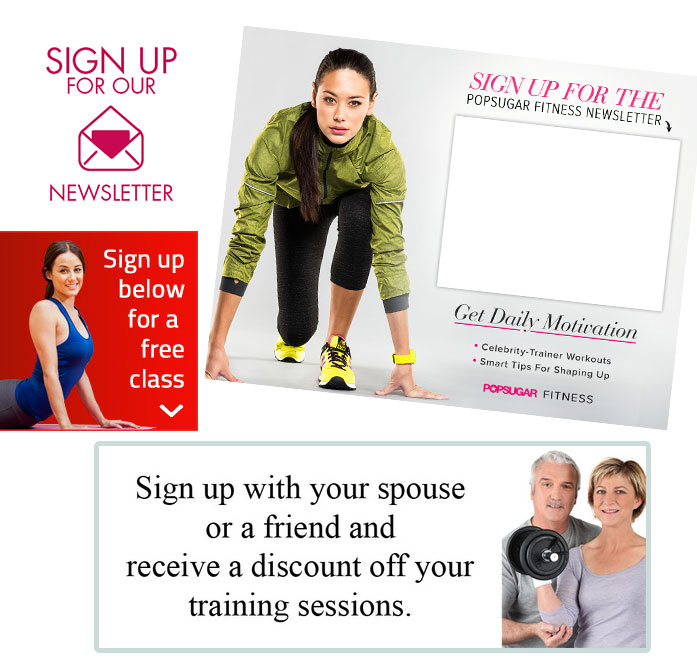
Yes, Twitter followers, Instagram followers, Facebook fans, and YouTube subscribers are all important when building and promoting your brand online; however, having a solid and ever growing email list is still the most important! Your website should have a place to gather email addresses of your visitors, whether it be along the side tab or a pop-up with something like “Subscribe to our fitness newsletter” or “Enter your email address to receive our free healthy eating cookbook” etc. This is how you will connect with your potential customers on a regular basis and these will become potential future customers.
Easy to find information about your services
If your website is too hard to navigate, people will just give up – trust me! Make sure that your website is friendly to even the most technology “un-savvy” client, because if people can’t find your services or more information within a very short time of being on your side they will give up and move on to the next option. Therefore is important to have website pages setup for the main things that people look for when searching personal training, such as Bio/Description, Plans/Rates, Contact and maybe even a Special Offer page.
Quality Content
Don’t always try to sell something to your current and potential customers, as they will be able to see right through that. Be sure to provide quality content on your website and upload on a regular basis to keep people coming back and checking your site on a regular basis. Your goal is to build a relationship with your readers that will make them want to share your content with others and to continue to grow your following. Write blog posts that will directly help your readers. Try to discover tips and information you can provide that people can use right away related to fitness, healthy living or nutrition tips.
Don’t Overdo it on Ads and Pop-ups
There is nothing more annoying that going to a website and having a bunch of pop-ups and ads be thrown all over your screen. I personally think it looks cheap and kind of “try hard” and quite frankly I have been guilty of just hitting the big “x” in the top right corner to get away from the madness. Find a happy medium to promoting your services without driving potential customers away. One simple pop-up to promote a current promotion or collect an email address is ok, but that should be it!
I hope this helps you either build a successful website for your online business or re-vamp your current website to increase online personal training clients and further build your brand.


