In the last Trainerize upgrade, we made key changes to lower the learning curve for both clients and trainers when working out with Trainerize. Let’s review the changes.
Easy guidance on first use of phone apps
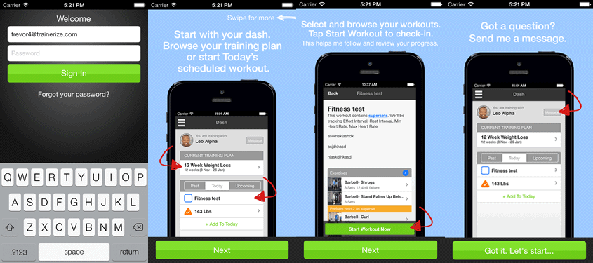
Upon signing in, clients are greeted with a simple starting wizard to guide them through the various features of the iOS and Android app. They’ll be shown how to browse their training plan, start and check-in for a workout, and message you through the app should they have any questions.
Quicky add scheduled workouts to a day, then “Start it” to complete it
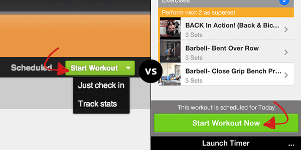
We’ve gone through and further simplified scheduling and tracking. Now you can just quickly add a workout or cardio activity to a day to build out a training schedule. When you pull up a scheduled item, simply use “Start” to flag it as completed.
- Checking-in just says I’ve done it and checks it off as completed on the calendar.
- Tracking with stats goes one step further and allows you or your clients to say I’ve done it, and entered workout data while doing it. This can be later graphed or displayed through our great reporting tools.
New Look and Feel for Calendar Icons
We’ve gone through and reworked our icons across the platform so you get a better experience on the website and phone apps.
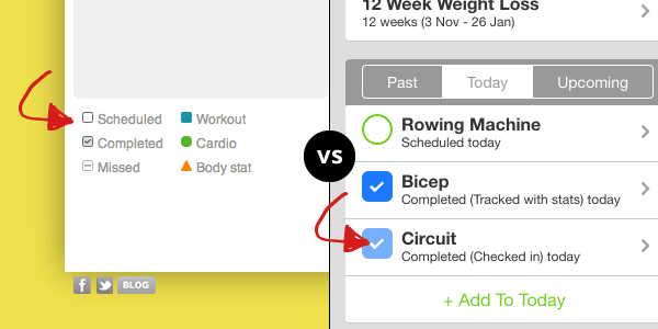
- Shapes show what kind of activity it is (workouts, cardio, body stat measurements)
- How the Shape is shaded in shows client progress.
- Scheduled items are always shape outlines.
- Missed items are shape outlines filled in with –.
- Completed items are always filled in and checked off.
- Check-ins are shaded lighter
- Tracked with stats are shaded darker.
A lot of the features we put into the new upgrade came from your feedback, so thank you for making our platform better. If you have any questions, please email [email protected] and we will be happy to assist you with whatever you need.
Team Trainerize


