Save the date! On March 5th, 2021, your mobile app simpler and easier to use. With the design tweaks we’ve made, it’s still the same app and features you love, only better!
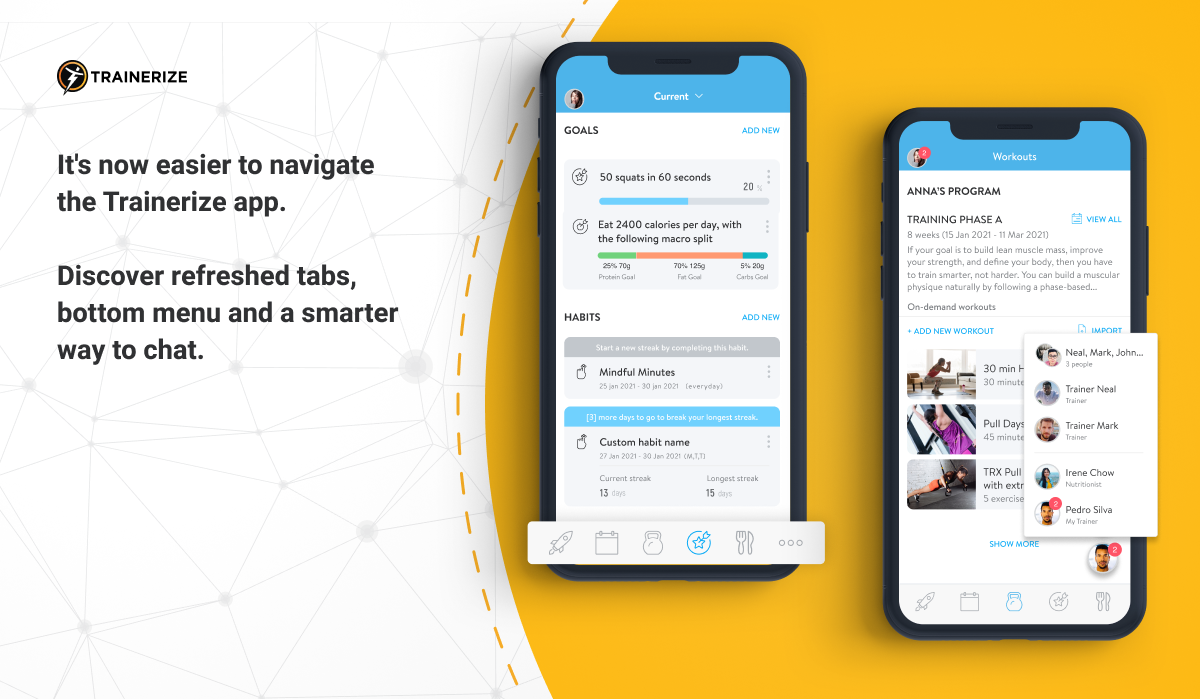
We’ve streamlined and simplified the look of the app with a few things like adding two new tabs for Goals + Habits and Meal Plan, replacing the messenger tab with new ways to send a message, and making the bottom menu icons simpler!
Keep reading to learn more about what’s being changed to your mobile app.
New menu tabs you’ll will love
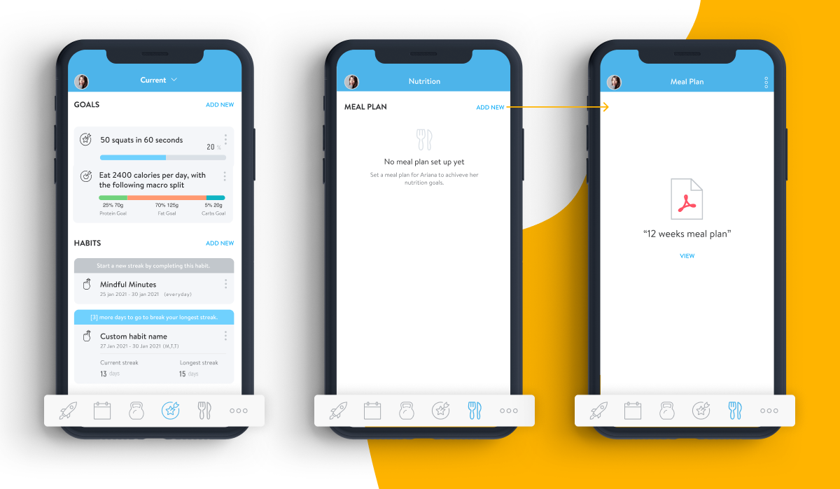
We’ve simplified the way the bottom menu looks on your app. We’ve replaced the messenger tab with not one, but two new tabs you’ll love having quick access to instead!
Our Goals + Habits tab will house all of your goals and habits, including your nutrition goal. While the new Meal Plan tab will display your assigned meal plan, plus more nutrition features coming soon, so stay tuned!
Note: If you haven’t been assigned any goals, habits, or meal plans these tabs will not appear on your bottom menu. That way, you only see what is applicable to you on your mobile app!
The chat bubble, a more powerful way to chat
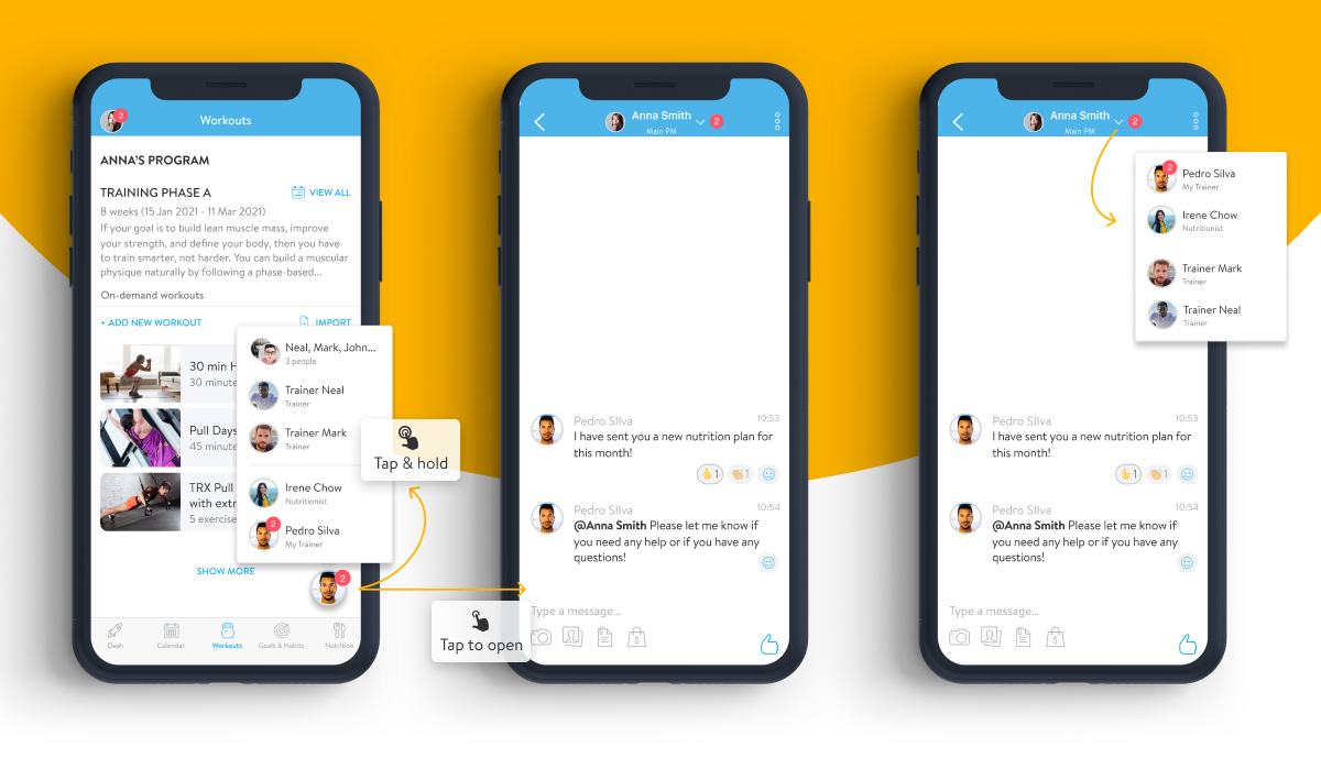
To make room for our two new menu tabs, we had to collapse the Messenger tab under the chat bubble.
You will now see a chat bubble instead to access your message threads. You will see your assigned trainer as the default chat bubble displayed. To bring up other message threads, you can press and hold the chat bubble. Plus you can click up top to display a dropdown of other messages.
Larger icons, cleaner look
Lastly, with the new changes being made to our navigation menu, we also took the chance to simplify the display of our icons by dropping the text. We hope you enjoy the cleaner look of the larger icons and decluttered menu!
And that’s a wrap! We hope you like these few improvements to your mobile app and happy training!


